Variance partitioning: a seductively simple, but misleading idea
In the context of statistical modelling, one often comes across the idea of variance partitioning, which quantifies how variance of a variable can be explained by an experimental feature. In this blog, we highlight why this simple idea can lead to misleading intuitions and apparent paradoxes.
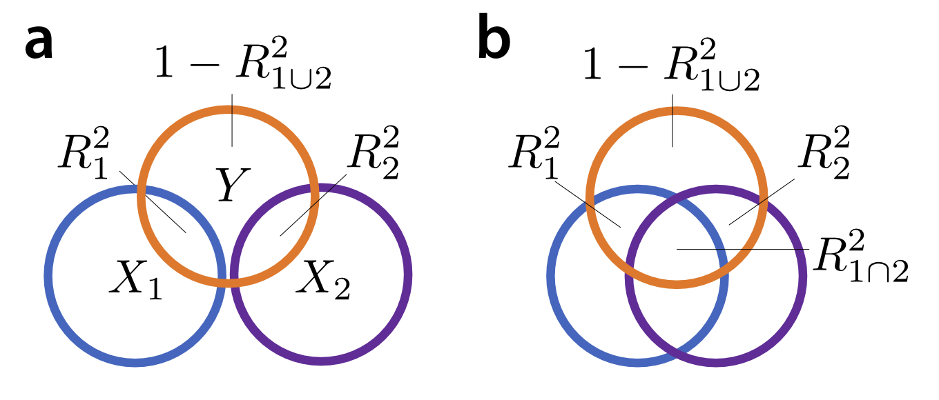
The idea of variance partitioning in linear models goes back to Fisher's ANOVA (Fisher, 1925). The proportion of variance explained by a certain set of predictors is the $R^2$ value for that model. In the case of a balanced ANOVA, where $X_1$ and $X_2$ are orthogonal, the variance explained by the joint model that combines the two regressors ($R_{1 \cup 2}^2$) is the sum of the variance explained by each one alone ($R^2_1 + R^2_2$). Thus, we can think about the variance of $Y$ as a pie that can be sliced a part that is explained by predictor $X_1$, a part that is explained by predictor $X_2$, and a part that is unexplained by either (Fig. 1a).
The trouble starts when we try to generalize this intuition to the more general case in which $X_1$ and $X_2$ are correlated. In most cases, the variance explained by two predictors together is smaller than the sum of the variance explained by each regressor alone. This is because, so the logic goes, there is a "shared" proportion of the variance that can be explained by either regressor. Thus the joint explained variance is the sum of the individual explained variances minus the overlap ($R_{1 \cup 2}^2 = R_{1}^2 + R_{2}^2 - R^2_{1 \cap 2}$), a relationship that is often depicted as an overlapping Venn diagram (Fig 1b). Following this logic, the variance explained by one regressor alone ($R^2_1$) consist of the 'shared' variance ($R^2_{1 \cap 2}$) and the part that is 'uniquely' explained by the regressor ($R^2_{1 \setminus 2}$). This approach can be extended for more than 2 groups of regressors (de Heer et al., 2017).
So far, so intuitive. However, thinking about the variance explained by different models as a Venn-diagram can give you a number of wrong intuitions - and cause apparent paradoxes that will seem very confusing. In this blog we want to illustrate some of these cases and provide some more helpful graphical intuitions.
The first incorrect intuition you may take away from Figure 1b is that the variance explained by two regressor together ($R^2_{1 \cup 2}$) can never be bigger that the sum of the variances explained by each regressor alone. After all, that would make the "shared variance" ($R^2_{1 \cap 2}$) negative, right? Unfortunately, it is quite easy to generate a situation in which $R_{1 \cup 2}^2$ is larger than the sum of $R_{1}^2$ and $R_{2}^2$. This phenomenon is due to an effect that is known in the statistical literature as suppression.
To understand when and how suppression leads to a "negative shared variance", let us consider the space of all possible correlations between two regressors ($r_{1,2}$), and between the dependent variance and each regressors ($r_{y,1}, r_{y,2}$). Knowing these three correlations is enough to analytically derive the different explained variances for the simple 2-regressor casesee this jupyter notebook for the mathematical details.. Not all combinations of these three correlations are possible - for example, if the two regressors are highly positively correlated, then their correlation with the dependent variable must be either both positive or both negative. The space of of possible 3x3 correlation forms the geometric shape depicted in Figure 2.
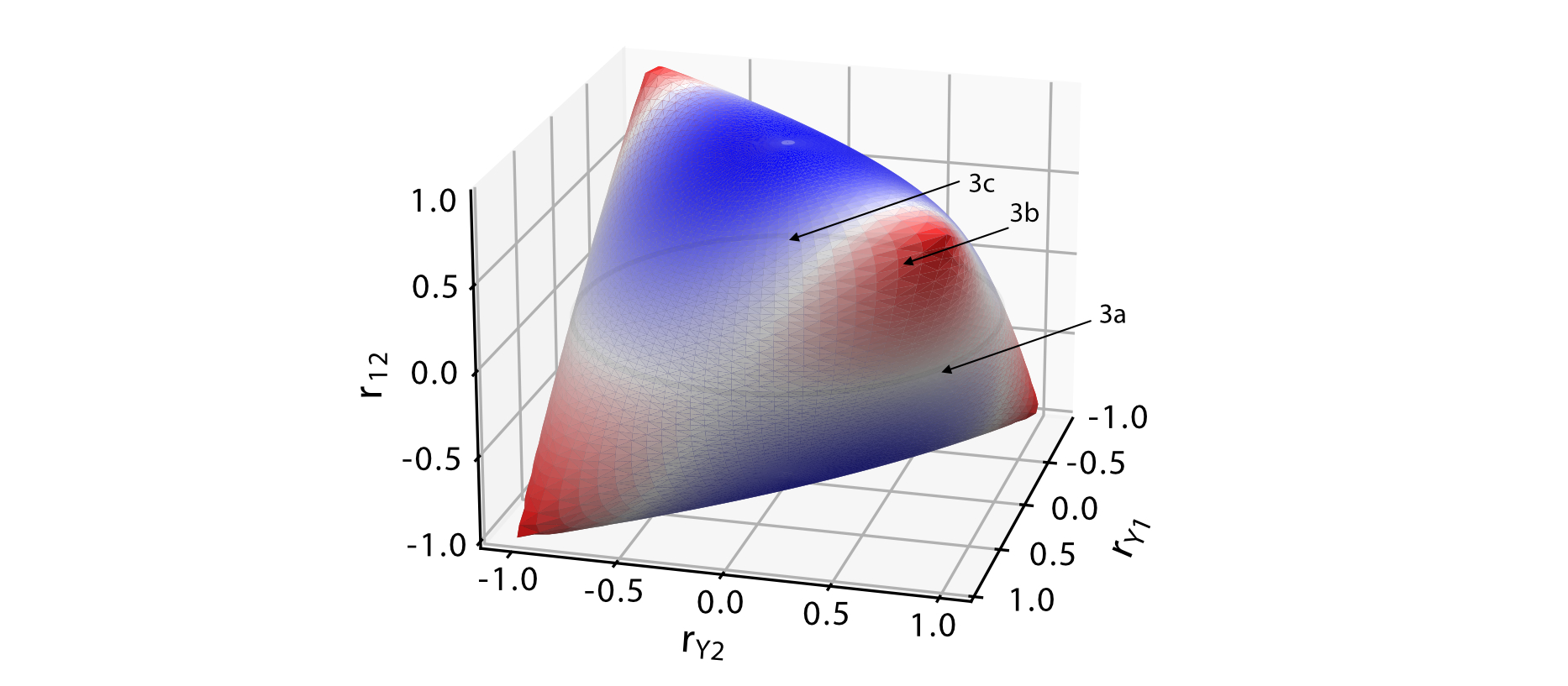
Along the 'equator' of this shape, where the two regressors are uncorrelated, the explained variance of the joint model is the sum of the individual explained variance, indicated by the white color. A useful graphical intuition is to think about the two regressors and the data as vectors in a $N$-dimensional space, with $N$ being the number of observations in our data vector (Figure 3). Simple regression can then be thought of as the projection of the data ($\mathbf{y}$) onto the vector ($\mathbf{x}_1$), or the vector ($\mathbf{x}_2$). For the joint model (multiple regression) the projection is onto the plane spanned by both vectors. The projected point (green dot, $\hat{\mathbf{y}}$) is the predicted value, and the squared length of its vector is the explained variance of the model.
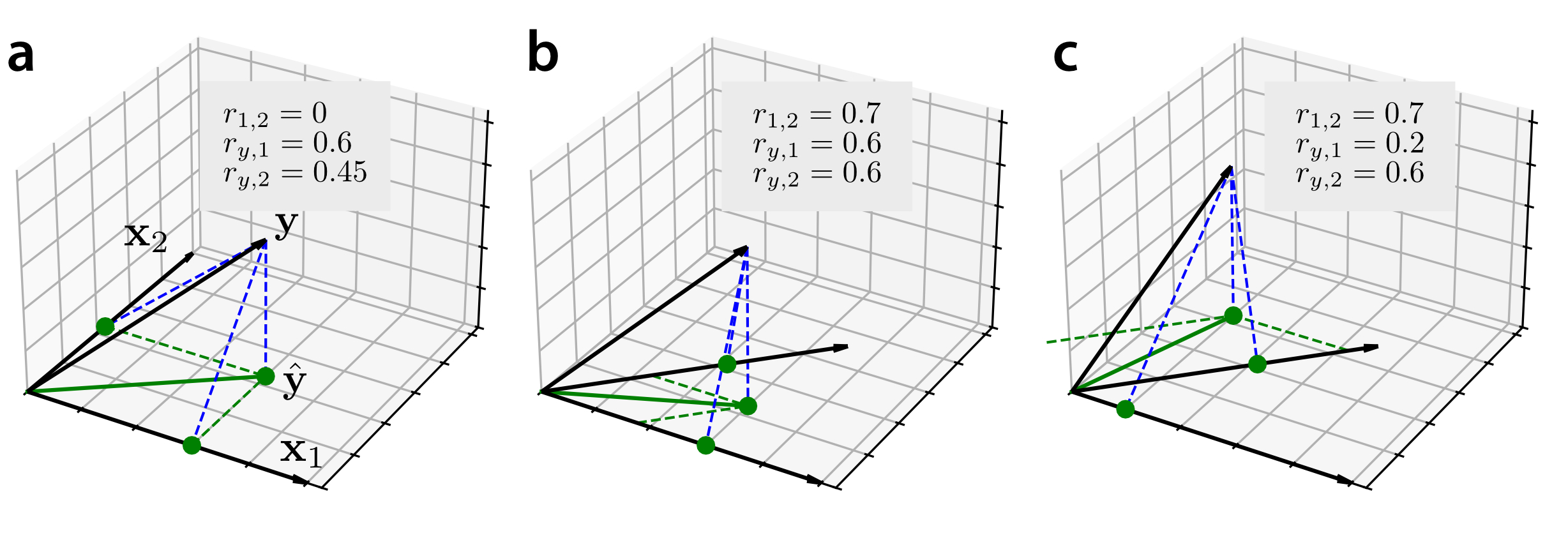
In the case of orthogonal regressors (Fig. 3a), we can immediately seefrom the Pythagorean theorem $c^2 = a^2 + b^2$ that $R^2_{1 \cup 2} = R_{1}^2 + R_{2}^2$. For correlated regressors, the situation is a bit more complicated. When the predicted value $\hat{\mathbf{y}}$ falls right between the two regressors (Fig 3b), the contribution of each regressor to the joint model (semipartial correlations, green dashed lines) is substantially smaller than the contribution of the regressor alone.
However, the opposite can also be the case. Figure 3c shows a situation in which $X_1$ by itself explains very little of the data. When entered in into a joint model with $X_2$, it makes the contributions of both regressors bigger than their contributions alone. This leads to a situation in which $R^2_{1 \cup 2} > R^2_1 + R^2_2$. The phenomenon is called suppression: Even if $X_1$ does not explain any of the data itself, it can help in the overall model by suppressing or removing parts of $X_2$ that do not help in the prediction of $Y$, thereby increasing the overall explained variance. This effect dominates for half of the possible values of correlations, as can be seen in the blue areas of Figure 2. Suppression does not only occur in bi-variate simple regression, but generalizes to larger models with multiple groups of regressors, and to the setting of regularized regression.see this jupyter notebook for examples.
Ok, you may say, but as long as we are in a situation as depicted in Figure 3b, where $R_{1 \cup 2}^2 < R^2_1 + R^2_2$, variance partitioning should work fine? After all, in practice suppression seldomly dominates.This is likely because most often both regressors are positively correlated with each other and the data, that is we are only looking at one quadrant in Figure 2. Unfortunately, however, the difference between the $R^2$ of the joint model and the sum of $R^2$s of the single model is always determined by the balance between the overlap between the models and their suppression effects. That is, suppression will affect results, even if it does not dominate. Therefore, thinking of the difference in explained variance ($R^2_1 + R^2_2 - R_{1 \cup 2}^2$) an estimate of the "shared variance" can be misleading.
Specifically, it can lead to another incorrect intuition: when we observe that the $R^2$ of the joint model is the sum of $R^2$s of the single model, using variance partitioning, we would conclude that the shared variance is zero and the two regressor are explaining independent aspects of the data. However, as we can see in Figure 2, there are areas with high correlations between regressors where $R_{1 \cup 2}^2 = R^2_1 + R^2_2$. These situations arise in cases in which the shared variance and suppression effects cancel each other out. In these case, the predicted values of the single model are correlated Indeed the correlation between predicted values is $r_{12}$ or $-r_{12}$, depending on the sign of $r_{12} r_{y1} r_{y2}$ - so following this logic the two regressors DO explain overlapping aspects of the data. This also applied to situation in which model overlap and suppression do not cancel each other out exactly. In general, a smaller difference between $R_{1 \cup 2}^2$ and $R^2_1 + R^2_2$ could therefore imply less overlap or stronger suppression between models, and these two effects are impossible to disentangle.
In summary:
- the explained variances for simple models and their combinations do not behave like a Venn-diagram
- the interactions between regressors is simultaneously shaped by the amount of overlap (which lowers the joint $R^2$) and suppression effects (which increases the joint $R^2$)
- the estimate of "shared variance" can become negative if suppression effects dominate
- an estimate of zero "shared variance" does NOT mean that two regressors explain non-overlapping aspects of the data
- in general, the estimate variance partitioning will underestimates the model overlap, and overestimates the unique model contributions, as it ignores suppression effects
Thus, the contribution of a specific regressor must always be seen in the context of the other regressors in the model. The simple idea of partitioning of variance into unique and shared parts by comparing simple and joint $R^2$ values does not do justice to the whole complexity of how two regressors can interact. Therefore, depicting the variances explained by different models as a Venn-diagram should always come with a big red warning label.
References
Fisher (1925). Statistical Methods for Research Workers.
de Heer et al. (2017). The Hierarchical Cortical Organization of Human Speech Processing. Journal of Neuroscience.